
Typography
Primary Font - Source Sans Pro
Aa Source Sans Pro
Source Sans Pro is your base font. Paragraphs and all basic text are in this font. If you need to assign this font, use the class .font-primary.
Secondary Font - Fira Sans Condensed
Aa Fira Sans Condensed
Fira Sans Condensed is your secondary accent font. Page titles (H1 headings) and other accent texts use this font. If you need to assign this font, use the class .font-secondary.
Third Font - Fira Sans
Aa Fira Sans
Fira Sans is your tertiary accent font. Buttons and other accent texts use this font. If you need to assign this font, use the class .font-third.
Headers
h1. This is a very large header.
h2. This is a large header.
h3. This is a medium header.
h4. This is a moderate header.
h5. This is a small header.
h6. This is a tiny header.
<h1>h1. This is a very large header.</h1>

<h2>h2. This is a large header.</h2>

<h3>h3. This is a medium header.</h3>

<h4>h4. This is a moderate header.</h4>

<h5>h5. This is a small header.</h5>

<h6>h6. This is a tiny header.</h6>
Paragraphs
This is a paragraph. Paragraphs are preset with a font size, line height and spacing to match the overall vertical rhythm. You have several options for highlighting text. The <strong> tag makes text bolder. The <em> tag makes text italicized. You also have available the .underline class to underline your text as well as the .uppercase class to make your text uppercase.
<p>You have several options for highlighting text. The strong tag <strong>makes text bolder</strong>. The em tag <em>makes text italicized</em>. You also have available the .underline class to <span class="underline">underline your text</span> as well as the .uppercase class to <span class="uppercase">make your text uppercase.</span></p>
Links
The standard link colors are preset to the Primary and Secondary colors. This is an example of a link.
<a href="">This is an example of a link</a>.
Dividers
Use dividers to define breaks between paragraphs or sections.
<hr />
Unordered and Ordered Lists
Use an unordered list to list things if the order of the items doesn't matter. Use an ordered list when creating a list where the order of the items is important, like ranking something from best to worst.
Unordered List
- List item number 1
- List item number 1
- List item number 1
<ul><li>List item number 1</li><li>List item number 1</li><li>List item number 1</li></ul>
Ordered List
- List item number 1
- List item number 1
- List item number 1
<ol><li>List item number 1</li><li>List item number 1</li><li>List item number 1</li></ol>Styled List
- List item number 1
- List item number 1
- List item number 1
<ul class="styled-list"><li>List item number 1</li><li>List item number 1</li><li>List item number 1</li></ul>
Blockquotes
You gain strength, courage, and confidence by every experience in which you really stop to look fear in the face. You are able to say to yourself, 'I lived through this horror. I can take the next thing that comes along.'
Eleanor Roosevelt
<blockquote><p>You gain strength, courage, and confidence by every experience in which you really stop to look fear in the face. You are able to say to yourself, 'I lived through this horror. I can take the next thing that comes along.'</p><cite>Eleanor Roosevelt</cite></blockquote>
Text Alignment
Left Aligned Text
This the the standard alignment for text. Lorem ipsum dolor sit amet, consectetur adipiscing elit, sed do eiusmod tempor incididunt ut labore et dolore magna aliqua.
<p class="text-left">This the the standard alignment for text. Lorem ipsum dolor sit amet, consectetur adipiscing elit, sed do eiusmod tempor incididunt ut labore et dolore magna aliqua.</p>
Right Aligned Text
Lorem ipsum dolor sit amet, consectetur adipiscing elit, sed do eiusmod tempor incididunt ut labore et dolore magna aliqua. Ut enim ad minim veniam quis nostrud.
<p class="text-right">Lorem ipsum dolor sit amet, consectetur adipiscing elit, sed do eiusmod tempor incididunt ut labore et dolore magna aliqua. Ut enim ad minim veniam quis nostrud.</p>
Center Aligned Text
Lorem ipsum dolor sit amet, consectetur adipiscing elit, sed do eiusmod tempor incididunt ut labore et dolore magna aliqua. Ut enim ad minim veniam quis nostrud.
<p class="text-center">Lorem ipsum dolor sit amet, consectetur adipiscing elit, sed do eiusmod tempor incididunt ut labore et dolore magna aliqua. Ut enim ad minim veniam quis nostrud.</p>
Justify Text
Lorem ipsum dolor sit amet, consectetur adipiscing elit, sed do eiusmod tempor incididunt ut labore et dolore magna aliqua. Ut enim ad minim veniam quis nostrud.
<p class="text-justify">Lorem ipsum dolor sit amet, consectetur adipiscing elit, sed do eiusmod tempor incididunt ut labore et dolore magna aliqua. Ut enim ad minim veniam quis nostrud.</p>
Colors
Using the color classes to switch out font colors is simple. Just assign that color class to your tag.
Heading 5 with Primary Color
This paragraph has a font color change in the very middle.
<h5 class="color-primary">Heading 4 with Primary Color</h5><p>This paragraph has a <span class="color-primary">font color change</span> in the very middle.</p>
Buttons
A basic button can be created using the .btn class. You have your choice of two buttons colors, .btn--primary and .btn--secondary. If you'd like your button to stand out a little more, you may also add the class .btn--large.
Standard Button With Primary Background
<a class="btn btn--primary">Press Me</a>
Standard Button With Secondary Background
<a class="btn btn--secondary">Press Me</a>
Standard Button With Third Background
<a class="btn btn--third">Press Me</a>
Responsive Videos
To make an embedded video responsive, add the class .flex-container to the containing tag.
<p class="flex-container"><iframe src="//www.youtube.com/embed/rd3A-y5sO5o" width="560" height="315" frameborder="0" allowfullscreen="allowfullscreen"></iframe></p>
Tables
Use tables for tabular data. To make your table responsive and styled, add the class .table to your table tag.
| Your Table Title | ||||
|---|---|---|---|---|
| Header 1 | Header 2 | Header 3 | Header 4 | Header 5 |
| Item 1 | Item 2 | Item 3 | Item 4 | Item 5 |
| Item 1 | Item 2 | Item 3 | Item 4 | Item 5 |
| Item 1 | Item 2 | Item 3 | Item 4 | Item 5 |
| Item 1 | Item 2 | Item 3 | Item 4 | Item 5 |
| Item 1 | Item 2 | Item 3 | Item 4 | Item 5 |
<table class="table"><thead><tr><th colspan="5">Your Table Title</th></tr><tr><th>Header 1</th><th>Header 2</th><th>Header 3</th><th>Header 4</th><th>Header 5</th></tr></thead><tbody><tr><td>Item 1</td><td>Item 2</td><td>Item 3</td><td>Item 4</td><td>Item 5</td></tr><tr><td>Item 1</td><td>Item 2</td><td>Item 3</td><td>Item 4</td><td>Item 5</td></tr><tr><td>Item 1</td><td>Item 2</td><td>Item 3</td><td>Item 4</td><td>Item 5</td></tr><tr><td>Item 1</td><td>Item 2</td><td>Item 3</td><td>Item 4</td><td>Item 5</td></tr><tr><td>Item 1</td><td>Item 2</td><td>Item 3</td><td>Item 4</td><td>Item 5</td></tr></tbody></table>
Components
Lists
- Enim veniam nostrud est sit duis.
- Adipisicing ullamco dolore esse ullamco proident cupidatat pariatur ut proident esse sit culpa reprehenderit id.
- Sint amet aliqua non ex do commodo magna incididunt cillum.
- Do aute fugiat exercitation occaecat elit eu fugiat proident consectetur deserunt incididunt.
- Exercitation dolore mollit nulla ullamco nisi deserunt Lorem enim.
- Officia Lorem incididunt enim et culpa velit id nostrud cupidatat voluptate reprehenderit aliqua labore.
- Nisi duis adipisicing et voluptate id id.
Decorative Intro
Intros to styled pages, also used within bands. Spacing is determined by variants of the deco-intro class, but to complicate things, can also be affected by variants on the band class of the container.
These examples use class outlined to add a border purely to show spacing. Remove this class for use in production pages.
Standard Intro
This intro has built-in padding and includes an icon. No variant classes are required.
Standard Intro, but wider
This intro has built-in padding and includes an icon. The normal intro constrains the width to a max width of 600px. Use class deco-intro--wide to remove the max width and let the containing column div set the width.
Standard Intro Minus Icon
This intro has built-in padding but no icon. No variant classes are required. Remove the icon markup and voila!
Less Space
^^^ The above version of the decorated intro has much less spacing built in and is intended to not have copy included. I guess it could also have copy? We'll see if that's ever called for in the designs. Uses the deco-intro--less-space variant class.
No Space
Use class deco-intro--no-space to remove all vertical padding from the intro.
No Space Top
Use class deco-intro--no-space-top to remove all top padding from the intro.
No Space Bottom
Use class deco-intro--no-space-bottom to remove all bottom padding from the intro.
Contrast Intro
This intro has built-in padding and includes an icon. Text and icon are white for use on dark backgrounds. Uses the deco-intro--contrast variant class. Icon color is determined by SVG code.
Pricing Callout
Info Cards - Media
Framing
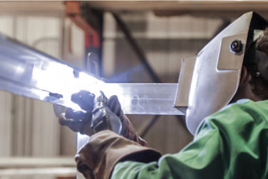
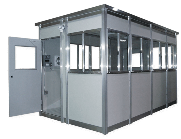
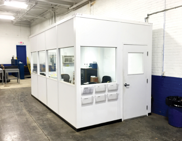
Simply put, PortaFab’s rugged booths are built to last. Their sturdy all-welded framing ensures a structural integrity that outperforms competing booths that use pop-rivets or other fasteners.
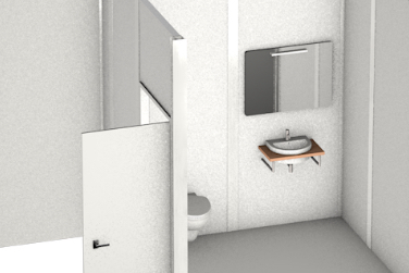
Wall & Ceiling Panels
Booths come standard with textured FRP wall and ceiling panels specified for their excellent durability, weatherability and low maintenance requirements.
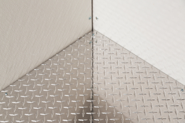
Flooring
Standard flooring options include our slip-resistant, aluminum tread plate panels ideal for high-traffic industrial environments and our durable, yet cost-effective vinyl flooring.
Wall & Ceiling Panels
Booths come standard with textured FRP wall and ceiling panels specified for their excellent durability, weatherability and low maintenance requirements.
Flooring
Standard flooring options include our slip-resistant, aluminum tread plate panels ideal for high-traffic industrial environments and our durable, yet cost-effective vinyl flooring.
Framing
Simply put, PortaFab’s rugged booths are built to last. Their sturdy all-welded framing ensures a structural integrity that outperforms competing booths that use pop-rivets or other fasteners.
Info Cards - Icon
Receive a Price Quote
To receive a price quote, you can either visit our online configurator to price out your booth with different options or you can fill out our RFQ form and our sales team will respond.
Need Additional Information?
If you have general questions or would like to download specifications and drawings of a booth, please visit one of the pages linked below to request or access the information.
Info Cards - No Action
Used purely to highlight features or convey additional details. No link, smaller heading. Note that width of cards is determined solely by their container.
Smaller Heading
Some text is generally highlighted using a <strong class="color-support"> tag. The smaller heading requires variant class info-card__title--small
Smaller Heading
Also, the text is slightly larger than normal cards! This requires the info-card__text-larger variant class, which can be used on other card types as needed.
Info Cards - With Chart
Used purely to highlight features or convey additional details. No link, smaller heading. Note that width of cards is determined solely by their container.
Smaller Heading
Culpa eu nostrud proident eiusmod Lorem aute velit voluptate minim reprehenderit aute ad dolore esse. Enim pariatur officia cillum esse voluptate excepteur quis incididunt nulla nulla. Tempor elit in nisi sit cupidatat in dolor anim aliquip enim proident. Ut pariatur incididunt eiusmod proident magna fugiat id incididunt qui cillum duis. Mollit ipsum aliquip occaecat magna amet officia eiusmod. Est cillum ullamco veniam magna eiusmod officia proident veniam laboris quis irure ex.
| Panel Thickness | STC | R-Value |
|---|---|---|
| 2” | 32 | 3 |
| 3” | 31 | 11 |
| 4 5/8” | 31 | 16 |
Smaller Heading
Dolore esse velit quis est minim incididunt. Anim aute est aute qui non deserunt. Incididunt reprehenderit eiusmod ut pariatur mollit enim elit dolore elit magna. Commodo cillum tempor tempor mollit. Non voluptate laboris sint eu veniam adipisicing cillum nisi.
| Panel Thickness | STC | R-Value |
|---|---|---|
| 2” | 32 | 3 |
| 3” | 31 | 11 |
Highlight Cards
These cards are intended as callouts, featuring an image and a single line text title that is linked. The card action changes color on hover.
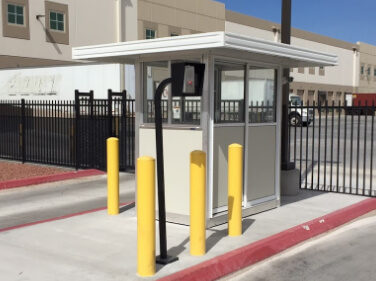
Image Blocks
Can be used with or without text caption that follows the shadowed block area. Can have a heading title or a paragraph description in the shaded area.
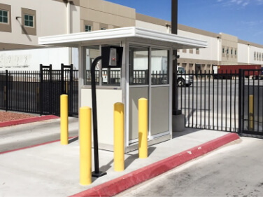
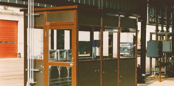
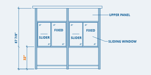
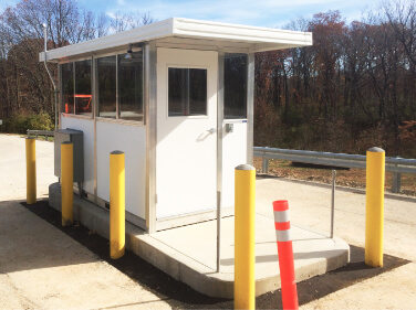
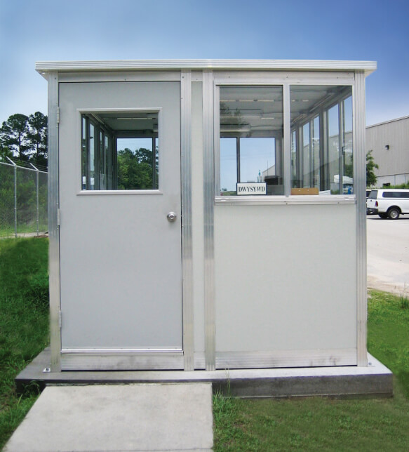
Standard Overhang
The standard overhang roof option extends up to a maximum 24” on each side of the booth.
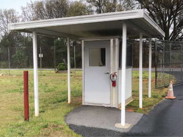
Extra Overhang
Overhangs that extend beyond 24” are possible, but typically require the use of support columns.
The SteelSpan system was fabricated quickly and easily to integrate with the systems conveyors and air circulation equipment.
Icon Blurbs
Standard icon blurb with text description.
Contrast icon blurb with text description. Uses icon-blurb--contrast variant class.
Bands
Primary Color Band with Bump
Secondary Color Band with Bump
Tertiary Color Band with Bump
Support Color Band with Bump
Gray Color Band with Bump
Band Spacing
Primary Color Band with Bump
Uses band--booth for spacing specific to booth band.
Secondary Color Band with Bump
Uses band--no-space to remove all vertical padding from the band container.
Tertiary Color Band with Bump
Uses band--no-space-top to remove all top padding from the band container.
Support Color Band with Bump
Uses band--no-space-bottom to remove all bottom padding from the band container.
Content Panels and Boards
Cutout Panel
Provides a content block and cutout image vertically centered to each other. The cutout will overhang the content block in large sizes. Intended for use on non-white backgrounds (as content block has a white background). Variant classes created as needed to slightly adjust the positioning of elements relative to each other.
Board Title
Our standard wall panels feature a textured FRP surface specified for its excellent durability, weatherability and low maintenance requirements. When a more durable solution is needed for extremely harsh environments, steel and aluminum faced panels can be specified.
Board Title
Our standard wall panels feature a textured FRP surface specified for its excellent durability, weatherability and low maintenance requirements. When a more durable solution is needed for extremely harsh environments, steel and aluminum faced panels can be specified.
Quick Installation
Ideal for quick retrofits.
Clean Installation
Fast, clean installation.
Turnkey Solution
No need for contractor, architect or other trades.
Cost Effective
Especially compared to architectural glass walls.
Pre-Engineered
Adjust easily to irregularities in heights (uneven ceilings).
Large Range of Sizes
From free-standing 8’ and 9’ office partitions to 40’ floor-to-ceiling demising walls.
Proident duis ullamco et deserunt
Board Title Larger
Lorem ipsum dolor sit amet, consectetur adipiscing, sed do eiusmod tempor incididunt ut labore et dolore magna aliqua. Ut enim ad minim veniam, quis nostrud exercitation ullamco laboris nisi ut aliquip ex ea commodo consequat.
- Enim veniam nostrud est sit duis.
- Adipisicing ullamco dolore esse ullamco proident cupidatat pariatur ut proident esse sit culpa reprehenderit id.
- Sint amet aliqua non ex do commodo magna incididunt cillum.
Modals
Modals (or popups) are used to display information in an overlay, generally triggered by a click or other event. Portafab uses a modal system to display videos in popups.
Icons
All the icons added in the updates for the booth and wall partitions sections, new case studies, etc. (Anything new since mid 2019)
ico-110-volt-outlet.svg
ico-220-volt-outlet.svg
ico-accessories.svg
ico-additional-info.svg
ico-blueprint.svg
ico-blueprints--white.svg
ico-booth-specs-no-ruler.svg
ico-booth-windows.svg
ico-windows--smaller.svg
ico-circuit-box.svg
ico-clean-build.svg
ico-clean-install.svg
ico-conduit-run.svg
ico-custom-doors.svg
ico-door-accessories.svg
ico-doors.svg
ico-easy-to-clean.svg
ico-electrical-component.svg
ico-electrical-equipped.svg
ico-exterior-lights.svg
ico-flame.svg
ico-forklift.svg
ico-forklift--smaller.svg
ico-gears.svg
ico-gfi-outlet.svg
ico-guidelines--white.svg
ico-handshake.svg
ico-health.svg
ico-height.svg
ico-hvac-options--white.svg
ico-insulated-panels.svg
ico-measurements.svg
ico-money.svg
ico-morale.svg
ico-paint.svg
ico-partition.svg
ico-price-quote.svg
ico-quality.svg
ico-shelves-drawers.svg
ico-roof-styles.svg
ico-scalable.svg
ico-screw.svg
ico-shipping.svg
ico-size.svg
ico-snowflake.svg
ico-soundproof.svg
ico-stop-safety.svg
ico-thermometer.svg
ico-time.svg
ico-visibility.svg
ico-wall-panel.svg
ico-wall-panel--smaller.svg
ico-wall-panel-alt.svg
ico-warm-up-booths.svg
ico-weather.svg
ico-welding.svg
ico-airflow.svg
ico-blueprint--primary.svg
0
ico-booth-flooring.svg
ico-hospital.svg
ico-booth-lighting.svg
ico-medical.svg
ico-medical-guidelines.svg
ico-booth-spec-options.svg
ico-booth-specs--blue.svg
ico-booth-specs.svg
ico-crane.svg
ico-demising-wall.svg
ico-electrical-access.svg
ico-sanitization.svg
ico-electrical-system.svg
ico-forklift--primary.svg
ico-guidelines.svg
ico-hvac-options.svg
ico-medical-details.svg
ico-mezzanine.svg
ico-money-stacks.svg
ico-roof-overhang.svg
ico-security-car.svg
ico-smoking.svg
ico-wall-partition--primary.svg
ico-wall-specs-ruler.svg
ico-warm-up-booths--alt.svg